#btw these designs are separate from my personal designs of these characters
Explore tagged Tumblr posts
Visit Tumblr Blog
Explore Tumblr blogs with no restrictions, modern design and the best experience.
Last Seen Tumblr Blogs


Fun Fact
Average visit duration of Tumblr.com is 10 mins and 25 secs.
Text
Fun little late birthday picture I did for @dragonitepaw ! She loves metagala so why not draw a pic of her favorite ship?

#diroxide art#kirby#kirby art#galacta knight#meta knight#metagala#btw these designs are separate from my personal designs of these characters#this is purely for the ship and has nothing to do with my interpretations ✌️#gift#I’m chill with ships outside of my own headcanons because everyone’s interpretations are vastly different and I respect it 🫡#my Galacta will ALWAYS have a star Marking on his eye so that you know who he is/what story timeline he belongs too
135 notes
·
View notes
Text

#;ooc#ooc#venchu staring off the distance-#i dont have high graphics but even then u can get the vibes-#god i love p.enacony so much; it gives me such aura- the vibes are SO good; impecable#the music too; its so relaxing;; luxurious-#i think s.tar r.ail peaked so much with it; like the next part must be really REALLY good in order to top it for me#i love when 'arcs'/areas in game have these very distinctive aesthetics/vibes in the sense of;;#where u could follow the design principles and come up with something coherent that perfectly fits the place#which is what i feel like n.atlan in g.enshin kind of missed#and why a lot of the characters look completely separated from n.atlan#like you can get a feeling when u see charas like l.yney; l.ynette; f.urina; n.euvi that they come from the same time and area#they follow such a clean cohesion that even when their designs are distinguishable and different from each other ; you can get the vibe sti#which btw im always up for things that fall out of the box; bc things arent always so rigid and 'fitting'#but i dunno;; n.atlan was such an all over the place area still; that the differences didnt feel enriching and engaging#and this isnt about the usual yadayada about m.avuika's motorcycle like im done with seeing that argument#i mean the -general- lineup; including looks/personalities/kits; all#anyways whatever what do i even know#bc even if n.atlan wasnt my cup of tea; maybe to someone else its their fav region u see#like how sometimes i dont vibe with n.asu's stuff; but other people do; thats just how tastes are#;delete later#dl#i dont tend to vibe with those strict unwavering labels that sometimes people impose; sometimes they can be very restrictive creative wise#but in my experience; having a -base- root/concept can help the inmersion and meaning behind things a lot#and it becomes an overall more memorable thing#like from knowing that base; you can expand and branch out and still make it feel engaging and new and different
7 notes
·
View notes
Text
the trans experience of making your 4th oc that basically just looks like you and realizing that you yourself are bascially just a physical oc
#like- Jay was the first self insert oc- inserting myself into real life lmao#ofc i keep using these design elements- its what i like- i used them on myself first#get ready for a ramble sorry my parents called to talk about gender stuff earlier so im feeling introspective#between senior year of hs and freshman year of college i basically became a new person- new name new haircut (some) new clothes new pronoun#new glasses frames i havent changed since whereas i used to change them every 1-2 years#its kind of like having trans friends in the later half of hs and getting more online unlocked a character customization option for myself#my mom asked me today if i feel more comfortable presenting like i do now than i did before and I honestly didnt know#i didnt think much about gender or presentation while i was her#i don't think i was “uncomfortable” but I didn't especially liked how i looked i guess#i certainly didn't make self insert ocs that looked like me back then- or really any self insert ocs at all#i had ocs that i would imagine being but they werent really me- they were more separate from myself than my current ones (and all women btw#i wish i had been able to become Jay sooner bc its way more fun#but its ok bc i can be him now#and keep changing and updating the “design” as i go bc it seems so limiting to only be one way forever#my diary
2 notes
·
View notes
Note
Seems like you have finished so i just need to say this:
DR0 is so fucking good.
Just, at EVERYTHING its trying to do, it hits it. And thats something that cannot be said about most of the other media in this franchise (not saying one is better over the other btw, thats a separate thing)
Like, it does its job of being THH's prequel. It goes into more depth with Kyoko and her father's relationship, it gives more insight into the destroyed classroom and what happened, it explains the massive plothole(?) of how exactly Junko was able to steal class 78's memories, it gives a better look at how exactly Junko was able to take over HPA. It gives so much context and answers to things the first game didn’t have the time to properly explore.
It does its job of setting up for SDR2's twist (as you are supposed to read it BEFORE the second game btw (it also released in 2011, a little under a year before SDR2)). It sets up the HPA is corrupt, that the staff dont care about its talentless students. It gives us the info that Kamukura and Junko are working together, and thats WHY the founder's portrait is in the funhouse. It also preps us for the twist, and why it feels so out of left-field in the game if you didn’t have the context of DR0 before. (I could make the argument that thats why both hajime and izuru share design elements with yasuke, because of the whole him pretending to be izuru thang but thats mostly speculation on my part lol)
But, most importantly, it gives us more depth into JUNKO. Something we lost in order for the first game's twist to happen. Ryoko is such a fun character, my lil goober, and such an interesting aspect to Junko that people either do not know about or think is solely Yasuke's creation (it is not, thats very clear in the novel). To think, that the girl that burnt the world down, was deep down a silly lil redhead with a weird crush on her childhood bestfriend is literally the best way Kodaka could’ve took her character. Its so funny but so fucking tragic, to fall in love with this protagonist and realize she was doomed from the start.
anyway sorry for the ramble, i love Ryoko and Yasuke and their story so much
NO RAMBLE AWAY THANK YOU FOR SHARING. i loved DR0 and honestly i may reread it again very soon because i miss Ryoko and want to spend more Quality Time with her.
i have so many thoughts about DR0 so here's a few scattered ones as i slowly wake up this morning:
DR2 has SO MANY MORE DR0 references than i realized
i would have taken an adaptation of this over DR3 tbh. like hands down
i feel bad for everyone involved in this event. even Kamishiro. yes, really
i also, personally, see Ryoko as not at all separate from Junko. to me she is representative of Junko's soul and past, and when she fades away it's not so much Ryoko disappearing as a person but Junko symbolically chucking away anything that gets in the way of her worldview. she is not Yasuke's creation i agree
(i headcanon, as i've said, that Ryoko is basically how Junko was as a kid, just a little less bratty. i also tend to think that Ryoko Otonashi is Junko's real name or close to it)
(and i did tear up when Ryoko "crumbles." i like to think that Ryoko and Junko, for a moment, both existed at once there. both were sad she had to go.)
Ryoko being so sweet and bubbly and not wanting to actually kill anyone causing her trouble is such a HUGE. HUGE. HUGE. signpost to Danganronpa's themes.
and Junko musing that she may lose, i like to think, comes from the fact that she knows she's wrong somewhere. deep down, even Junko...who is shown to be self-hating...is just a little goober who loves Home Alone and thinks she can below up Kyoko Kirigiri with her mind.
Ryoko being weirded out by Makoto??? forget the intense foreshadowing in that scene. Ryoko picking up on his energy??? he's pure without the use of neuro-tech???? incredible
the chapter where Junko is kicking the shit out of Matsuda's corpse should be required reading for all DR fans. it humanizes her so much. my headcanon that she is constantly in the throes of this wild psychic pleasure-pain and is like, spiritually suffering, seems to be more or less supported here
the last chapter where Junko and Mukuro are talking also provides a TON of subtle clues as to their relationship. it totally comes off like Junko STILL being so bitter that big sis Muki ran off to the military and left her all alone for a few years ha
so there's my ramble in return !! what a fantastic yarn. so tragic. so good
59 notes
·
View notes
Text
Kaeya's design pt.2 (updated until 5.1 because yes, more stuff gets added with updates, his design is that thought ahead)
or maybe im delusional and looking into things way too much! heyy, Me again!! this is gonna be a master post of all the things ive noticed about kaeya's design, ive made one like it before but since then there's been a bunch of new stuff so i decided to make a new post that has everything i have to note. this is complied of things i myself have noticed and things that others have. this post will not include anything about his skin other than noting a couple of significant differences since the outfit wasn't made specifically for him in the scope of the story, but i might cover it in a separate post
kaeya's design mostly consists of "two sides" in a way, his "mondstat" side and his "khaenri'ah" side.

his mondstadt side includes his vision, the full side of his cape in the back, the earring he wears and his rat tail, all this represents the freedom he has in mondstat and the person he grew to be there, a vision bearing knight of favonius.
the khaenri'ah side includes his eyepatch, the wisp of lighter hair in his bang, a clipped cape ("wing") and the majority of the fur coating. i believe this goes to represent that he's still tied to khaenri'ah despite all the time he's spent in mondstadt, and that he's quite aware of it. Also, the glove on that side has a kind of buckle that kind of reminds me of a shackle or a handcuff, as well as this thing with a bunch of eight pointed stars that are not apparent on the mondstadt
all across his design (the boots, corset belt, gloves, little things on the ends of the cape thing he has, his left sleeve) there are bunch of "eight pointed" stars we see associated with khaenri'ah, one being in his pupil which was a confirmed trait to khaenri'ahn people ever since we saw dainsleif.
id like to note that kaeya's eyepatch is stressed on a lot in game. its constantly referred back to most of the time when kaeya is brought up. he has a voiceline about it (that has been changed once in the english version to to a mistranslation i believe, ill include both versions) the first is the current version.


traveler has a voiceline about it where paimon makes fun of it but i think its notable there's a voiceline specifically about it at all.
its mentioned right when we start the world quest "Bough Keeper" where we meet dainsleif. he doesn't even have an eyepatch half of his face is just black it was a stretch in the first place.

kaeya himself dismisses it as nothing unusual.

in his story quest he says he inherited it from his grandfather, which is solid proof that they're related by blood. (his story quest has some crazy foreshadowing btw that predicted that him and the abyss twin are possibly related in some way or another by extensions but i wont get into it here)

there isnt really a solid idea attached to any of this, other than the fact that kaeya's eyepatch is stressed on as a point of intrigue, its pretty implied to be related to his origin of khaenri'ah, and we often see khaenri'hn people with their right eye covered in some way. and to those of you that think that he wears the eyepatch because diluc injured his eye during his fight, no he isnt. it might've been scarred by him yes but he isnt blind in that eye, and in the webcomic it shows kaeya wearing an eyepatch on the day crepus died, before the fight with diluc.
while we're on the subject of his eyes, he's somewhat of an abnormality amongst Khaenri'ahn people. every other khaenri'ahn person we know have teal eyes with their pupil being a bold black star outline, kaeya's on the other hand are a darker blue with a more faded filled in star. i wont include the eyes of every single character to prove my point but trust me i looked at them all. the only exception seems to be pierro but since he doesnt have an in-game model yet and he wasnt shown super clearly in the trailer im unsure what to make of it for now so i wont include it.

one of the first things generally noticed about kaeya's design once you look into it a little is that he somewhat resembles cryo abyss mages, most notably the fur coat he keeps thrown over his shoulder, the "bunny ears" in his hair (ahoge?) but most of the resemblance comes from playstyle.

in playstyle he's similar in the sense that he teleports on his fifth attack, his ult is similar to the icicles they produce after their shield is broken, he produces his own shield at c4 etc.
(EDIT: i somehow forgot including abyss heralds here, which is insane of me considering that i was always under the impression that if kaeya does turn out to be an abyss monster its definitely more likely to be a herald/lector. i dont necessarily think that he is but there are similarities!)
As for abyss heralds, he does also have a similar design element with the Frost Fall one! Despite being a minor similarity i think its worth pointing out , but they do have kind of similar lapel things, the herald has those wing like things both in the front and back , similar to kaeya's "clipped" wings, that appear under the full wing and in the front of his outfit as well

(fun fact, when i found out they're going to release a cryo abyss herald i was so excited and kept prolonging the fight with it in the quest so i can see if it has similar attack patterns to kaeya) (it does, he does a couple slash attacks that look like kaeya's normal attacks)
one crazy thing also is his cape looks a lot like the top part of the celestial nails and the bottom part of the statues of the seven, and weirdly enough parts of paimons outfits.


a lot of people theorize the log in screen is the enterance to celestia, and that the nails in dragonspine and the chasm are fallen pillars from there. for someone from a godless nation its sort of weird that he seems to have that connection to something celestial huh? this part of the design is also included in his special dish in the skewer itself. (he also marks the mushroom with an eight pointed star as opposed to the x on the regular one)

other than celestian, mondstadtian, khaenri'ahn themes in his outfit, he also has fatui ones! on the front side of the cape we can see that it attaches to a fur thing that covers kaeya's lapels. i have no idea how this attaches or if its just thrown on top, but this design choice is distinctly fatui, weirdly enough. specifically in the style of the attire of the fatui harbingers coats or official ware when they're gathered. i related it distinctly to pierro before but after getting a good look at capitano's model its more fatui, though there's some things that are similar distinctly between kaeya and pierro.

most distinctly, the fur and the lapels being in a very similar shape which is the part that's distinctly fatui, the mask/eyepatch over the right eye as well a strikingly differently colored strand of hair being distinct to pierro and kaeya.
there's a kind of gap in the middle of pierro's chest part of the outfit that somewhat resembles the one kaeya has as well. i saw someone point this out on reddit but i cant find the post because it was a while ago but regardless, they brought up the point of it being exactly in the place and shape of where abyss heralds/black serprent knights have an eight-pointed star, which could be a subtle nudge at khaenri'ah as well.

now, i have two ideas of what those similarities could be hinting at.
kaeya is actually a fatui member (which i believe has some sort of merit because of the recent appearances of capitano and some similarties between them in attire and playstyle weirdly enough, as well as a theory ive been getting behind that states that capitano could be/is related to anfortas alberich)
the fatui harbinger design choices are actually inspired by khaenri'ah, which isnt a stretch given that pierro is the founder and director of the fatui harbingers. thus making them look similar to kaeya rather than vice versa.
panning back up a little bit, regarding the silver hair in kaeya, it seems to be expanding to the rest of his hair, in his skin it goes down the length of his braid.
in the webcomic where we flash back to the past a bit, we see kaeya actually doesnt have the little strand of silver over his left ear, as well as when we return to the normal time setting of the comic, its also not included in his icy featherflight splash art (this 100% could be a stretch on my part they could've just forgot about it its a small strand) (while we're talking about stretches, my biggest one is that childe has a similar streak in his hair lol but that might be going toooo far)

last but not least, his vision, one of the most interesting things about his whole characters. a person from a nation that actively defied the gods recieving a sign of their recognition seems like kind of a threat doesnt it? and its all the more ominous that his vision casing is different from every other mondstadt casing!


this is the back of kaeya's vision next to the back of diluc's vision for comparison, the only notable things are the lack of a third wing probably signifying he's sort of out of place, and the swirl? wave? whatever you wanna call it is on the wrong side. every other character with a double sided vision has the swirl on the other side like jean, diluc, mona, eula, lisa (etc..? i havent seen anyone else with a double sided vision which is also interesting, at least from mond)
however!! weirdly enough, in the 3.8 summer event where kaeya gets his skin, his vision actually gets a different casing, as you can see he gets his full three wings, as well as an extra spike! but not really an extra spike because the vision is just on top of another thing that makes it look like it has a third spike, but the wing is actually there. the genshin fashion archive isnt updated with kaeya's skin so i cant check if there's a swirl, even though the vision isnt even double sided in the skin which is also really weird to me.


im pretty sure ive covered most things, if anyone has any additions please let me know! id love to look into them.
i think kaeya is a really interesting character who's incredibly centered around foreshadowing in the way he carries himself and his backstory, so to think that they managed to extend the foreshadowing bit into even his design is a little bit insane imo.
#kaeya alberich#kaeya theories#kind of#genshin impact#genshin impact lore#the fatui#the fatui harbingers#il capitano#pierro genshin impact#mondstat#paimon#celestia#the abyss#khaenriah#khaenriah lore#diluc ragnvindr#kaeya lore
104 notes
·
View notes
Text

Pinterest showing me the most wholesome and accurate representation of Aurora and Phillup.
In case you do not care to read this whole blog:
Too long not going to read: Sleeping Beauty is the standard both romantically and artistically.
I was totally about to say "they're so MamOuSa coded" but ya know what? I also just really freaking love these two so much.
Sleeping Beauty was the first Disney story I ever watched/was introduced to. My mom had a Disney classics collection story book and she also bought Sleeping Beauty Platinum edition for me and my sister. Ever since I was little it's been my favorite. Phillip is 100% the best prince there ever was. Aurora is so pretty and sweet and honestly relatable. The three good fairies are actually quite entertaining and I think they have a lot to like about them. Maleficent is the most iconic Disney villainess there ever was.
AND THE ART?!?! This movie has got to be the most esthetically and artistically pleasing animated film in history. The character designs fit the background to a tee. The first thing I ever noticed about the art as a child was the use of geometric shapes (square trees) and bright, saturated colors for the props and characters. It's just a freaking masterpiece.

The story makes me swoon in a very similar way that the first arc of Sailor Moon does (I mean duh I've said this a million times)
Prince and Princess betrothed from birth but separated before ever meeting and the first time they do meet is 16 years later as perfect strangers and fall in love as ordinary people, a boy she met in the woods as she was leaving her cottage and the first thing he does upon seeing her is sweep her off her feet and pull her into a dance. Then they are told that they must marry their betrothed but Oh no! What about that wonderful stranger I met and can't stop thinking about? And then the curse that Phillup has to wake her from; and he does not hesitate whatsoever the minute he learns that his betrothed and the girl he's falling for are the same person (thanks to a top tier villainess taunt/speech from Maleficent btw) and be rushes to her and defeats the wicked villainess and awakens her and then THEY LIVE HAPPILY EVER AFTERRRR

Ahhh it's just- ack I'm in love with this storyyyy.
I do not however think I'd be as moved by it if I were to read the original fairy tale. Just a hunch-
66 notes
·
View notes
Note
you said you were taking requests for character/media analysis so here is my humble request: a while ago you wrote a post about different characters and the ways they get mischaracterised and i read it all and it was all super interesting, and at the end you said you could have gone on about neil josten. so my request is that i would love to know your thoughts on neil and how he gets mischaracterised by the fandom
Oh wow! Thank you for this ask, because it's definitely an interesting one! I am always always always open for character discussion and differing opinions, as well as being not normal™ about media - which is my designation in fandom spaces as is late. Meaning I think way too much and way too hard about the most insignificant of details.
So, when I made that statement about Neil Josten, it was made in the context of me having not read All For the Game or really interacting with AFTG fandom since around... I want to say 2018. And if there's anything to say about 2018 fandoms, it's that mischaracterization was rampant, especially with queer characters. I think characterization of Neil has improved. Exponentially. So, this is more an overview of trends. Fandom, especially in terms of characterization, has stepped back to allow nuance - which is a blessing, really, because every time a character with nuanced and interesting character traits is reduced to a single recurring trope I die a little inside. My soul shrivels like a prune and I want to scream. I will say it's not... really an issue anymore? (I'm back in fandom, btw. That statement was actually about Tik Tok and how atrocious they are at handling characterizations. And how funny it is to think about 2016-2020 fandom characterization where everyone is either cinnamon role or unapologetic sinner.)
Neil Josten suffers from the same issue that, interestingly, Wylan suffers from in SOC fandom. Which is that people don't want to believe a person can be two things. That Neil can be earnest and loving and care about people, while also being capable of, say, ordering a hit out on somebody and remaining cool and calm in face of crisis. Which is an interesting trait of his. Inside Neil's head, he's analytical, judgemental, and distrustful. He's quick to dislike people, or tell himself to dislike others. He's evasive and anxious and terrific at concealing it. He loves, and he loves selectively and deeply and in varying shades. He also hates and disdains and forms grudges he cannot move on from. (I want to compare him to a fox, who shows great loyalty to those close to their hearts, while maintaining healthy distance and mistrust of strangers. I also compare him to a raven, who remembers those who have hurt them, and remember those who have done them well.) He's more sentimental than he'd ever admit (I think of his mother, Jean, Kevin, and Andrew first and foremost. Because he exhibits a great deal of affection, but doesn't always disclose it to the reader.), and he's vindictive. He's in incredible control of his emotions, and I think it weighs on him to be so restrained all the time. He wants freedom, and was taught freedom is being unattached and free floating - when freedom is, in my opinion, Exy and his own choice to stay and pick a family. He wants to run, and escape, and he wants to stay. He is sweet, and thoughtful, and viciously cold and calculating. There's a balance, and it's all to do with trust and vulnerability. (I actually think it's important to consider his relationship with his mother, who he exhibits a detached affection for? He's taught to separate himself from sentimentality early on in the series, but he retains a warmth and love in the way he speaks of and misses her. I'd argue he is the same with Kevin.)
What does this have to do with Wylan? Well, as I pointed out in the post you're referring to (which I need to either delete and rewrite or edit, because lord have my views changed. That was a notes app essay and I did not think it through or check my sources.), Wylan in earlier days of Six of Crows fandom was not given opportunity to be a multifaceted character. He was either "soft sweet sunshine boy" (Wylan Van Sunshine!!) or "mini Kaz." There was no middle ground. Which erased the most fascinating parts of Wylan's characterization. Which is that he can be both, can be the somewhat naive merchling AND be incredibly cunning and meticulous. He could have been Kaz, sure, but the circumstances he was found in - and how he was raised - do not make him like Kaz. And there's an intentional parallel between the two. That Wylan was granted the support and resources necessary from the Crows to stay soft, to stay kind, etc. And it isn't a diminishing of his character to do this. It's an active point being made that Kaz is guiding Wylan to develop in a way he never had the chance to. I won't go much into it, but the sentiment here is: erasing the multifaceted parts of this character ruins what makes the character (and the significance of his dynamics) so interesting.
So, Neil Josten. His personality is a product of his environment. He's a walking survival instinct, the flight response incarnate. Evade, evade, evade. And this warring principle of Neil's - his instinct to run, his desire to stay - is crucial to his early turmoil in the story. We, as the readers, are asked to consider what Neil wants, and what Neil is trained and conditioned to do. And Neil has been trained to be isolated, and fiercely loyal to himself (and his mother) in order to survive. And these two warring desires make Neil a gripping protagonist.
When one side is reduced, or erased, or shoved aside to make Neil one dimensional (so, either a soft, sad boy or a murderous and bloodthirsty menace) it in turn reduces the aspects of Neil that make him fascinating. It cheapens the moments when he's vulnerable and affectionate with others to make him like that all the time. And when we reduce this softer side of Neil, we lose the war he fights to avoid becoming his father. Because he veers into his instinct on occasion, having been raised to respond how his mother or father would act, but his journey is doing what Neil would do. How would Neil react? Does he run, like his mother? Does he power play, like his father? Or does he protect the people closest to him with the ferocity of a creature raised to stick with their pack? All of Neil's "violent" actions are borne from protective instinct. And that is the two sides of Neil converging. He takes a hit out on someone who has hurt someone he cares about, who reminds him of someone who has hurt someone he loves. I think, objectively, that Neil considering this a love language is actually insight into how he was raised and conditioned to view love. And his dynamic with Andrew, one of a fierce protectiveness and codependency, correlates with how Neil perceives love and family. And how his intention are so valuable here. His thought processes matter. And yes, I think it detracts from why Andriel as a ship is so important, because they love each other and they look out for each other. They give each other a home and someone to look out for. And the same with the Foxes. They've given Neil a home, a family, and they look out for him. And Neil, a child raised to be loyal to the very end, in turn looks out for them.
I really hope I am clarifying more so why I find mischaracterizations that strip both sides of Neil so frustrating. I could go on and on about how one queer man in a ship is made into the "omg what a soft little sad boy who needs to be protected omggggg" (a particularly grating quality I'm glad fandom has started to leave behind), and if he isn't the twee little twink he's the big bad coldblooded killer. And I'm not saying Neil is okay to kill people (though, I'd argue killing a rapist is okay, actually, a net positive, and we should do it more.), that he is in the right, nor am I saying he is one hundred percent just killing out of the good of his heart. But he is showing kindness in the way he was taught to? (And Andrew does the same, btw.) Reducing the warmer sides of Neil (which shows around Matt or Andrew or Kevin, etc) takes away from his growth as a protagonist, and reducing the less palatable parts of him makes us think it takes a single fucking year to undo years and years of being taught fight or flight as a response to every scenario.
Like I said, this happens a lot less in fandom, and I actually really appreciate that AFTG fandom has the ability to grasp that these characters have to be multi-dimensional to work and be compelling. My gripe with Neil is my gripe with the typical mischaracterizations that happen to queer men in popular mlm ships. With Neil, it's diminished since I was actively in AFTG fandom - and I've only recently gotten very very into it again. I cannot stress enough I was into this series in high school, and I've been on tumblr for well over a decade. I've tracked how fandom has changed, and I've engaged in some of these behaviors myself. (I love tracking fandom trends, btw. It speaks to the social aspects of fandom on a level that scratches my brain. It's the sociologist in me.)
(I do have a bone to pick with the dismissal of Neil being explicitly demisexual, but that's not a tumblr issue. That's why I came back to tumblr, because I was exhausted trying to remind people Neil is demisexual. But tumblr is good.)
I won't pretend to be an expert on Neil, so take this with a grain of salt and understand it's my interpretation of him. I find taking pieces of characters away to make them morally perfect very frustrating, and I find taking grey morality from characters more so frustrating. That's more my gripe and issue.
Anyway, I hope this answered that question? It's a more grand issue than just Neil, and my specific Neil issue revolves around how rancid Tik Tok is for fandom interaction (whole other problem), but Neil on tumblr is appreciated at this moment in time and I don't see egregious mischaracterization with him as often anymore.
#i hope i did this topic justice? this became more of a mini neil analysis than what you asked for but urtfejdn#i'd pick a fight but this ain't a tumblr fight this is a tik tok fight and they're already mad at me for the hunger games lmao#i have a complicated history with aftg that's only recently healed and so my perspective on the series has CHANGGGGED#but yeah the uwu-ification of neil josten (as i will call it) was something i loathed#especially bc it bled into trc fandom which i was far far more involved in during that time#okay rhfej this was a great great question#pls ask me things anytime i enjoy doing this sm#neil josten#aftg#nine-frogs-in-a-trenchcoat#all for the game
19 notes
·
View notes
Note
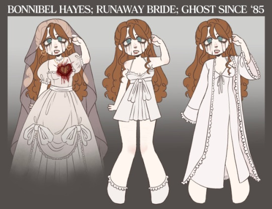
Can you tell us more about your oc? Bonnibel, I like a lot her design but I don't think I saw a lot about her...?
yes i can!!! yes i can!!!! tysm!
its confusing cuz Bonnie started as a basic self insert OC, BUT then i started putting her in a lot of different AUs and separating her from myself. considered making her blonde so she doesnt look like me LMAOOOO...
now theres 100 different versions of Bonnie with different groups/personal projects, BUT they're all relatively similar. I'll expand in this post! super long post btw i dont stop talking.
i'll separate this post by her general story, the differences between AUs, then art! if something is (bolded/like/this), that's because the information varies between AUs!
SO IF I HAD TO EXPLAIN HER GENERAL STORY...
HERE is a google doc to a longer, more detailed version of her backstory.
TLDR; she would visit her grandparents' orchard every summer as a child and get violently haunted by slendersick ghosts. because the ghosts deteroiated her mind, she would try to kill a ghost when she was 12, only to realize it was a real woman. She dragged the body deep into the forest (which slenderman ending up eating) and did not return to the orchard until she was (18/19/20). the story that follows varies from AU to AU
SO THE DIFFERENCES BETWEEN AUS...
the 'main' AU i used Bonnie in is a personal AU between my irl friends called Washed Up. it takes place in a fictional beach town we made called Almyros Coast, set in SoCal. . . AND THAT AU IS SPLIT INTO TWO AUS LOL. theres a more fun one that we use to let our OCs interact with the canon creeps and worldbuild with. theres a second version where ghosts still follow bonnie, which are victims of a serial killer that has been stalking bonnie's best friend, camila. antics ensue and the story is unfinished!
i have the 'Creeped' bonnie, which doesnt really have a huge story. i just insert her into my Creeped AU, where she lives on the farm that the proxies work on. this is VERY recent cuz of some anons asking abt it, so i dont really have a story for it. i dont intend to give bonnie a notable place in my Canon Creeped Au, but in a world where Bonnie is an important character, she'd be used to figure out paranormal issues in the forest
THEN THERES THE SLENDERMANSION AU!!!! THIS BONNIE IS SO FUN TO ME!! she's honestly a totally different version . HERE is a link to that AU
theres a few AUs that i have on a much smaller, intimate level with individual friends that i dont feel like expanding here cuz im laaaazyyy
OK SO ART
Creeped AU
Washed Up
Slender Mansion
General
30 notes
·
View notes
Text
The Veilguard review
Big spoilers ahead for the people that haven't finished the game yet.
So after plugging 70+ hours I've finally completed Veilguard.
This will just be a general overview of how I felt about the game, I'll likely do a separate one for Solas/Mythal and Lavellan and one for a Lucanis romance.
First off I want to say that any negative criticism I had for the game I am reminded of how difficult this game was to get off the ground running in the first place; it experienced multiple layoffs, it pulled the team to focus on Anthem when it failed, the team was reduced, OG writers left and multiple people lost their jobs once their work was complete and lets not forget those that worked on this during a pandemic so I think it's important to keep coming back to this so that we can just appreciate what we had as an end product.
Now the end product itself, did I enjoy it? absolutely.
I've laughed, I've been giddy, I've been angry at times and in those final moments was reduced to tears that reconciliations were reached and it was the end of a very long 10 year wait.
I want to start from the beginning where we welcomed our Rooks because holy moly is the character creator detailed. I mean seriously every single Rook I've seen is a catwalk model 😂
Every faction felt different and the brief history to your character was really well done; I went with a female mage elf I the Crows and I loved being a Crow from the get go; the decision that she made that essentially forced her to leave the Crows because she'd basically f*cked up a mission was really interesting because there's still that tension once she returned with Viago (who I adored BTW, his disappointing fatherly persona against Teia's comfort and protectiveness was just perfect) and it set the course for every Rook wanting to prove themselves.
Briefly touching on the Inquisitors creation I was so happy that this was an early decision and hearing her say "it's good to see you again" was like a stab to the heart and felt like I was being welcomed back home after such a long journey.
Once into the gameplay it's hard to ignore how beautiful the graphics look, Minrathous' design was so unexpected and how the locals were treated makes me wonder how Dorian ever survived 😂
There were certain scenes that just blew me away and made me realise just how far games have come to allow us them; the moment you open the doors at Weisshaupt and see Ghilan'nains massive looming face in the clouds was just breath taking, in fact the two gods in general were very well done and there wasn't enough of them in my opinion.
The animation as a whole was very good and again compared to Origins this game is on a different level of good (hate to compare it to other games but Balders gate is probably the closest contender).
There's a particular scene with Lucanis as a romance where he walks over to you after you basically say you like what you see and that Spite doesn't define him, the way his face moves, the little smile, the way his eyes drop to your lips when you touch him floored me and I think having motion capture for this game definitely paid off.
The mechanics of the game were fantastic and as I've yet to play anything other than my mage I am excited to play other classes and possibly Warrior for the first time across 4 games, although Spellblade ruined a mage for me as I love being able to be upfront in a battle and found it perfect for my Crow mage.
I went with purple Rook for this playthrough as I wanted a charming Crow who had far too much energy and was awkward in the best way possible and loved every minute of it; Bioware has always been very clever at establishing the different personalities and how they affect the world around them. Going into a scene and having your Rook react by themselves depending on their personality makes the character feel real and that we aren't just following the same thread of dialogue.
When you first meet Solas they didn't lie that it would feel like an end game mission, the dialogue was fantastic, his voice actor is just incredible and he has a talent to be confident, insecure, determined and doubtful of his own words all in one and it was very easy to fall In love with Solas during inquisition.
I really enjoyed how the first decision you make as Rook ends with the gods escaping, either Harding or Neve being injured which puts doubts in your friendship and leadership from the beginning, that Solas who we'd believed to be the big bad was essentially trapped and looked like a kitten compared to these evil beings who want world domination, it really makes the player question how are we going to fix this massive mistake that we've created, because it takes the gods no time to get to work whilst we scramble to find a team and cleanse multiple parts of Thedas at the same time aswell as setting up base in the fade where we dig deep into the history of Solas and the ancient gods past.
The companions of this game I felt were individuals in their own ways with their own back stories and present problems but I felt as a whole weren't as good as say the previous game; there was no double crossing mages or people with their own greed and agendas, no hidden pasts like Blackwall which personally fell abit flat for me.
In fact I'd say the only one who had an interesting story was Lucanis after his imprisonment and demonic possession and the struggles that came with it.
I don't think I'll romance anyone else other than Emmrich as the others just don't interest me.
It just felt like you were constantly flitting to the Lighthouse and back to grind out companion tasks in order to gain approval and faction points, there was no option to just have a conversation like previous games instead it was very much on their terms and where you were in the game which was something i really missed.
Still, their personalities were very different and characters like Lucanis, Taash and especially Emmrich stole my heart very quickly.
The banter was top notch quality as per 👌 some of my favourites were from Taash and Lucanis, just being a Crow in the middle of their conversations about capes was hilarious at times.
The voice acting as a whole was very good, I felt with some characters particularly Neve it felt abit flat in moments but Bioware have a knack for finding talented voices; having someone as bubbly and excited as Bellara to the deadpan and slightly blunt at times Taash made for a very diverse team.
Returning characters was always a welcome and there were some surprising cameos such as Isabella in the Lords of Fortune faction.
I know alot of people were disappointed that this game felt limited in bringing over past choices but it needed to make sense; Sera isn't going to return and be found in the deep roads etc, it needed to serve a purpose to The Veilguards story and I'm happy with the ones we did get.
When it came to the three decisions from inquisition yes I was disappointed at first; why are we ignoring who drank from the well, why aren't we talking about Hawke, who's ruling Fereldon, who's Divine?.
I think we need to remember that after 4 games the decisions from little to big are so vast that there's simply no way to fit it all in and satisfy everyone and baring in mind this game is for new players too.
Having this game set outside of Ferelden means those decisions won't carry weight in Veilguard, who is divine won't affect us, where Hawke is doesn't affect us because we know they'll either be in the fade or fighting against the evil.
And yes a codex could of helped address any of this but again, it's a smaller team now at bioware and the focus is on Rook this time around, it's their turn and tbh reading codex' is time consuming when you've got gods to fight 😂
The only decision I really wanted brought over was who drank from the Well because as a Solasmancer he was so pissed at me but I think I know why it was glossed over.
I think having Solas being able to control your Inquisitor would have the issue of consent and violation and as a romance that doesn't feel right, especially given how Mythal basically manipulated Solas and used him as a slave it just goes into uncomfortable territory.
We could also argue that Solas absorbed Mythals essence so all that's left is her memories and the tiny fragment you find in the crossroads so essentially Mythal ceases to exist thus there's no pledge anymore for the inquisitor and that she only needed her help to fight Corypheus, who knows but I'm glad Solas wasn't able to do that to the Inquisitor.
The endgame was amazing, finally killing Ghilan'nain was so satisfying and Lucanis was an absolute bad ass doing it, seeing Solas become the dreadwolf and hearing his pained cries was heartbreaking even if he couldn't stop betraying my Rook 😂.
Forcing you as a player to lose a character despite high factions and hero status was brutal, and I unfortunately lost both Davrin and Assan. As much as I loved them both, it made sense to his character to die in that way, and Harding has so much more to do for the dwarves and titans.
I'll talk about Solas/Mythal and Lavellan on another post but I was very happy with how it ended, seeing the art concept of him making himself tranquil just shows how differently it could of gone, and I honestly expected them to die in each other's arms.
If I think of anything else I'll add it onto this post but yeah, 10 years man and it's over, well not over completely as I'm creating an Emmrich romance as we speak but I can't believe years of speculation and doubt is now in our hands forever.
Yes this game could of been better in parts and blew my expectations away in others but I loved it and I think the negative criticism over characters like Taash, the three previous decisions, crazy solasmancers which bring the team down is so unjust and people need to reflect on themselves as humans.
All I would say to those that critic this game as heavy as they have is to take their time and play it again, you'll find things you missed the first time around, really read the codex', just sit back and understand what the characters are saying, read between the lines and just take it back to beginning of this post, this game very nearly didn't happen and alot of talented people that have given you this game have lost their jobs so please just be grateful for what we do have and pray that this isn't the end of dragon age.
Edit:
The whole Varric thing was probably my least favourite thing about the game, not because he died but it just didn't make sense that Rook didn't know until the very end.
I had my suspicions because he was always tired and going back to bed and something about it didn't feel right.
For other companions to say "oh we thought you knew" was just silly, I could understand Solas using his powers to create an illusion but why not on all the companions because surely Rook at some point was like "Oh i'll take some food to Varric" or "have you been to visit him", without that Rook just sounds crazy 😂
#dragon age 4#dragon age the veilguard#dragon age#da4#solas dragon age#solas#dragon age spoilers#dragon age the veilgaurd spoilers#veilguard spoilers#solas x female lavellan#solavellan hell#lucanis dellamorte
25 notes
·
View notes
Text
Uhhh, hey y'all, I found this in my drafts and it's basically completely done(I think?). So I've decided to let it loose.
This is also from approximately two years ago? So I think some of my opinions have changed, but whatever.
Anyway my here are my opinions on the usage of color and color psychology in the ever after high kids outfits! This is gonna be unreasonably long, so sorry ahead of time <3
.
.
.
.
Sorting them by their primary colors btw!
.
.
.
Let's start with warm colors!
Warm colors are ment to be exciting and stimulate reactions. Warm colors are stronger, bolder and more powerful, they're essentially the main characters of colors.
Red- power, sensuality, anger, urgency, heat, passion, confidence, warning, and danger
Apple white: to be honest I don't think using red as her primary color was the go. Red is a very strong passionate color and the feelings the color is ment to evoke aren't super present in Apple? I understand why the choice was made to give her red, as the apple in snow white is red. And often red is used to represent royalty and power, which are things snow white is shown to have, And Apple aspire to have. White is another one of her primary colors. White usually represents elegance, purity, and goodness and I feel like it could've good color for her to lean into it! Her last color is gold, gold is usually used as visual shorthand for wealth, wisdom or courage. Another color I feel is more in tune with Apple's personality. It's a color that can have two very vastly different meaning and I feel like that could be a fun thing to explore with her!
Cerise hood: it is very obvious why red is Cerise's primarily color lol, But it's a very good choice nonetheless. She very much represents a lot of red's traits, and honestly that's pretty interesting considering she has one of the more subdued personalities in eah. Despite this Cerise shown to be very confident in her abilities and genuinely a strong and confident character without being super gaudy about it. Her other main color is black, and to be honest before going back to check her character design I thought it was brown? Anyway, black is also color Cerise does a good job of representing. She has the dark intrigue and mystery of black while also encapsulating the strength and resilience! Her color pallet is definitely one of the more straightforward ones haha. Both colors also work when considering about her wolf side too. Cerise is just a very well rounded character, which is a little odd for eah lmao.
Lizzie hearts: yeah, she absolutely embodies red. As the future queen of hearts Lizzie has shown almost all these qualities, and because of the nature of the character she's Destined to be red fits(she also has love and heart motifs which I think really sell it). Overall lizzie is a very passionate and headstrong character, leading to her ability to embody such a bold color. Black is her other predominant color. black is most promently used to symbolize evil, and it definitely works in the context that she is In fact her mother’s daughter leading to her antagonistic spot in her story. Lizzie is not evil though, and a part that can come through in black is mystery! Lizzie herself is not particularly mysterious, but with wonderland being a place not super readily available there's a sense of mystery that comes from that.
Orange- excitement, confidence, vitality, energy, hope, wit, concentration, encouragement, and caution
Holly o'hair: Ok, so yeah, maybe orange isn't the most present color in her pallet, but I feel like it does a good job at representing her! Holly's character isn't the most fleshed out, overall both the o'hair twin were treated more like a unit as apposed to separate characters, but from what we got she does give orange vibes. Holly is the more outgoing, energetic twin and she is shown to be incredibly supportive of her sister and friends. She's also a very passionate fan fic author storyteller, and clearly pays a lot of attention to the things she's passionate about. Which is why I felt she fit here best! Another one of her colors is pink, pink is usually associated with softness, care, and femininity. A choice I think was very interesting is giving Holly (& Poppy) a stronger pink, stronger and brighter pinks give vastly different emotions from softer ones. For Holly specifically I think this was more so used to show her friendly nature, and seeming exitable nature. Lastly purple! The usage of purple in Holly is probably once again to tie her in with Poppy (they're the only two-piece siblings set with different sides chosen, so they were definitely going for a royal/rebel thing they have with Apple and Raven's color pallets; but more low-key), but it still can work in her color pallet. Overall the purple can be used to symbolize Holly's ambition, creativity, and royalty.
Yellow/gold- vibrant, energetic, joy, optimism, childish, attention, irresponsible, and unstable/ compassion, wisdom, charisma, wealth, success, tradition, greed, and extravagance
Daring charming: dude manages to completely encapsulate every trait of yellow AND gold, and you know what, good for him. Daring has got to be one of the only characters that manages to so blatantly represent their main color. He's the school's golden boy, and yellow/gold definitely encapsulates the energy and emotions a character who is held on such a high pedestal should. One thing that was done pretty well, but I feel could be done better, would probably be the extravagance and showsman-ship of Daring's character. Like, I feel like Daring would be very into the whole outward performance of the prince charming persona, if that makes any sense? His other main color is blue; out of the three charming siblings, Daring wears it the least. This could be used to show the separation of the other two, and more specifically, the higher level Daring is held, too. His lack of blue could also be used to his lack of empathy and self centered-ness or the lack of acknowledging his own true feelings. Dispite being incredibly self centered, often when the story centered on him Daring is shown to not be a bad person, he can be empathetic and vulnerable it's just hidden under layers of shitty lessonand morals he was taught. I haven't mentioned this so far, but another thing blue represents is masculinity. Daring is basically the masculine ideal, both at his school and the wider society of ever after, so its fitting.
Rosabella beauty: something I always found interesting about Rosabella's color choices is that her color palette is completely warm. So I find it strange thats she's such a dull character. I just think diving into a part of her that's more strong and charismatic could've worked? Anyway, there's potential in both yellow and gold for Rosabella. Yellow is very energetic, attention grabbing, and vibrant, gold is a color of success, wealth, and charisma. Both have surprisingly contrasting meanings, and both sides were used very little in her character. Side note but I absolutely hate how Rosabella's epic winter outfit is an absolute betrayal of her color pallet AND style direction! Most of the other central characters from epic winter have colder color palettes so the winter them lends more naturally to them. But they still could've done a better job on Rosabella's epic winter outfit!!! Her other color is brown, which I feel her charcter leans into a little bit more. Brown is a color of stability and honesty, which were communicated pretty well with the characterization we got, but brown can also be very boring and unmoving. Again, i feel that was shown, but over all I feel like her characterization was overall very boring and uninventive, Much like brown. Rosabella could've all around been done better, and I feel her connections to her main colors show that. I'm also 100% neglecting mentioning that stupid rose color they gave her on purpose. Just give her red you cowards!!! Are you scared of a girlboss or something mattel???
Neutrals!
Neutral colors are usually thought of as boring, they're used to tone down or bridge the warmer and colder colors of a pallet. Neutrals are often the safest choice went it comes to color as they are very uncontroversial and traditional.
Green- growth, hope, healing, balance, relaxation, safety, abundance, jealousy, cyclical, and guilt
Green is usually considered a cold color but personally I think it's a bit more of a neutral. It takes way to much of both Yellow and blue to be anything else.
Bunny blanc: having bunny here Is really funny to me for some reason?? Anyhow, her primary color is green, I thought it was blue, but that's not the point- Green! in general, Bunny doesn't really seem to fit in (visually) as well with the other Wonderlandians. It's probably because she uses the meekest form of green, compared to the other Wonderlandians who have very bold and present colors. Being completely honest, I don't actually like bunny in green? It seems like a weird choice, kinda. I understand the connection, but it results with bunny sticking out like a sore thumb. Also, bunny doesn't really represent green all that well? She doesn't really have much of a personality to begin with, but most of the secondary characters don't either, I work with what I have. Wow, look who created themselves a segway! Onto grey! Grey is everything conventional and boring, grey is the color of giving up, the visual representation of bla. of course, only when it's used wrong. Using it well isn't all that exiting(or revolutionary) either, but it has its caveats. More positively, it can mean; neutrality, balance, respect, wisdom, my hate for sportswear , and... sensibility? Yeah, grey isn't really a fun color, but it's a good accent color. It has the ability to look good when put in the spotlight, but I'm firm on my stance that it wasn't the go for bunny. Lastly, white! I'm of the opinion that white was criminally underutilized for bunny. She meant to be the next WHITE rabbit,so why white wasn't used more is a mystery. Not that much of a mystery because this was in fact a kids show, and using white as a main color is basically a no go for kids shows, but my point still stands, white would've been a better choice. So I conducted a little ✨️experiment✨️ to test it, and low and behold, I was right, white looked better. All this to say, I don't hate bunny or anything. I just think her portrayal was bland and underdone, and it happened that part of that stems from her color(and clothing) choices.
Hunter huntsman: green/tan/brown
Sparrow hood: green/black
Brown- earth, comfort, warmth, reliable, genuine, wholesome, boring, dull, and conservative
There's no brown font color, so forgive me.
Ginger breadhouse: ok, so idk If this is a controversial opinion but ginger should've had a brighter color pallet. Like I love her, but she definitely needed a brighter pallet. Anyway, brown! Its an earthly color that signifies nostalgia and warmth. Much like grey it's a safe choice, doesn't rock the boat much, like Ginger. She's very shy and generally trys to not be noticed much. And the way brown is used in her color pallet could be used to show that. Generally the use of brown in her encapsulates all of browns significance. it's a boring ordinary color, it very much contrasts one of her most noticeable traits; her bright pink hair! Yes, we're talking about pink next. Pink! It's another color that she manages to fully encapsulate. Pink is (more modernly) used to show vulnerability, and sensitivity, and weakness. It's a color heavily associated with feminity, often it's used to be unalarming (or innocent). So the fact that pink is one of her most prominent color makes such a fun little oxymoron when you remember she's ment to be the next candy witch! Another thing that I mentioned before is that brighter warmer pinks often are associated with louder, bolder, things. and Ginger is quite frankly, is none of that. Pastels probably would've fit her better, they would've also create a nice contrast to her hair! Idk I just think Ginger would rock pastels, that's all lol.
The cold ones!
Cold colors are often characterized as being mopey or sad, and too often people forget the power cold colors can hold. Historically cold colors have been seen as regal or holy.
Blue-greens/ teal- renewal, individuality, clarity, friendliness, protection, envy, morality
Didn't know where to put these two bc they have very mid-toned blues. Having them in the blue section would've also made it wayyyy to long for my liking.
Faybelle thorn: tbh Faybelle's color pallet is definitely one of my favorites purely for how visually appealing it is lol. It's a very different take on the dark fairy too. Usually the dark fairy has a more traditional villain-type color scheme, so giving her tones of blue was a very interesting choice. Also, putting her in blues and similar jewel tones puts her in direct opposition to Farrah, which is really smart tbh. Faybelle and Farrah are the two only prominent fairy characters, so putting them in direct opposition creates a, honestly, beautiful visual divide between "good and evil". I also find it funny that they're a royal and a rebel, which again creates another royal/rebel divide. Faybelle definitely embodies both the good and bad of teal, it's very fun putting characters that are ment to be villainous in traditionally un-villainous colors. It gives a very indivalistic look, which is often is more memorable. I'm also tired of seeing the same four colors being used for antagonistic characters. like, come on dude, I'm sooo tired of meeting a series' mega-villain and them being dressed in black??? It's so boring and makes otherwise non-threatening characters even more unlikable. like, ok edgelord, we get it, you want to destroy the word or whatever, maybe stop dressing like a stagehand and we'll take you seriously. Faybelle just manages to be a good charcters through and through, what else can I say.
Madeline 'maddie' hatter: teal/magenta/yellow.
Blue- tranquility, sincerity, intelligence, trust, empathetic, loyalty, coldness, fear, masculinity
Alistair wonderland: blue/brown
Ashlynn ella: blue/pink/gold
Blondie locks: blue/yellow
Dexter charming: Something overall the character designers did a surprisingly good job at, was making the Charming siblings look very distinct dispite other characters still wearing blue. That being said, Dexter's color choices are actually super interesting. Him having the most "technically royal" choices of blue is very interesting... Dexter is definitely middle child syndrome personified, being constantly treated as second fiddle(or third rather). Overall Dexter somehow hits almost every meaning blue has, It's really fascinating tbh. It really depends on the portrayal though, usually the show shows him more unremarkable and wimpy way. Whereas the books tend show him being overlooked dispite being as physically talented as Daring. Both do a good job at shining light on certain meanings of blue while still showing other more dimly. Next color is grey! Grey is a color of boredom, neutrality, balance, formality, practicality and innovation. I've said my peace on grey, but I think Dexter manages to be a good example of greys usage. It highlights his position in his family as resident second choice and nerd. Meanwhile not making Dexter stick out that much, it's nice to see grey being used in a less after thought-y way. And overall Dexter's character design is surprisingly well thought out.
Darling charming: Using a lighter pastel view was such a good choice for Darling! Like I said before lighter colors often emote children and innocence. So with Darling being Darling it creates such a fantastic oxymoron!!! And during dragon games her main outfit being a darker blue is just soooo, *chefs kiss*. Light blue is a also classic choice when designing princess characters, both because of blues connection to royalty and innocence, it's the quintessential classic damsel in distress color. Dispite this Darling is also very good at representing blues good qualities. She's shown to be very smart, insightful, and fiercely loyalty. Darling also represents a lot of masculine ideals in ways Daring does, and because of this she later becomes the white knight. Connecting to this, Darling's other color is silver. Silver representing glamor, grace, dreams, strength, and insincerity. This is facet of Darling character I feel could've been explored more. Because of the way Darling was, raised she is shown to bottle her feelings to show a constant perfect facade. The way silver is used in Darling could be used to show the image of perfection and glamor the Charming are supposed to represent, Along with Darling's more negative traits. Again, silver could've definitely been used more, but something I've noticed a lot is the kinda phenomenon(?) Of making Darling sway too far one way or the other. Darling manages to be a strangely middle ground character in a way? I probably can't explain it all that well, but an aspect I feel gets kinda ignored about Darling is that she enjoys certain aspects of the "performance" that comes with being a princess? Of course I'm not trying to ignore the heroic and knightly side of her, I just want to mention the lapse of inclusion when it comes to Darling's portrayals I guess? One of the better examples is probably her destiny. She's placed in a traditionally masculine role, but in the end still gets her heroism and prince(ss)- hood. She really gets the best of both worlds lol.
Purple- creative, independent, wise, ambitious, mysterious, magic, sophisticated, royalty, arrogant
Cedar wood: although purple is Cedar's most prominent color in her main outfit, pink is actually the color she wears most promently in other outfits. And tbh she absolutely rocks both. Anyway, Cedar does a fantastic job at representing purple! I think inherently, pinocchio is a story that matches purple, like, incredibly well. She's a character that has a lot of growing to do narratively, so her also being able to grow into the color goes great with her story. Let's talk pink next! Pink as a color represents generally very good things. It's a color that can have a lot of nuance, and like Cedar isn't often taken seriously. Again, pink lends very well to her story. it's a color that's often thought to be immature, fragile, and feminine, so it can be a good stand in for the more negative traits pinocchio has in the beginning of the story. A little off-topic, but Cedar as a character isn't a great Pinocchio? Which definitely leads to some questions regarding how she's supposed to complete her destiny. Cedar's kinda narrative fucked in a distinctly different way than the others... a detail I didn't mention before, is most of Cedar's colors are secondary colors. The reason I mention this is to point out the pink Cedar uses is actually peach! Which again, lends very well to Cedar and pinocchio as a story. It shares more meaning with pink than it does orange, and once again, was a great opportunity for Cedar to have a more dynamic character!!!
Duchess swan: her color pallet includes the usage of the lightest purples, which helps create the illusion of innocence as lighter baby shades are often associated with children. As the white swan she's supposed to represent a lot of the positive traits purple is meant to show. Purple has historical been a color that is hard to create and get as it doesn't naturally occur often. So the fact that Duchess wears purple, but only lighter shades, is ment to represent her 'not princess princess' status. Not to mention, she is the only royal with purple as a predominant color. The other predominant color she uses is white. Like I mentioned before, white is a shade that mean innocence, purity and elegance. White is chic and easy to soil, both things Duchess can represent, But she doesn't show many traits white is associated with too. I think its a little weird white isn't as prominent in her color pallet as she's quite literally ment to be the WHITE swan. Then again, it's a kids show and using white as a primary color for a character probably wouldn't pop as much. The last color of Duchess' I wanna talk about is black. Its actually not prominent at all in her clothes, but is in her overall color pallet because of her hair and often her accessories. Black mostly prominently means evil, death, and mystery. All things that Duchess' character heavily alludes too. The mystery of the whereabouts of the black swan, the possible near-death in her future, and Duchess' not so nice demeanor and the fact that she was put In General villainy, and what's associated with that...
Kitty cheshire: purple/grey/back
Poppy o'hair: purple/pink
Raven queen: I really love the use of purple for Raven. She has the darkest purples and it apposes the use of purple in Duchess, and the use of red in Apple. which create some funky little parallels i love so dearly. Raven is partially ment to represent the regal evil of purple. The evil queen is meant to be menacing and evil but still regal and classy. In reality Raven shows the more positive traits of purple, she's very independent, ambitious, and creative! Raven is also the only character with purple as a main color to show the mopey-ness of the color being cold. Her other main color is black! Black again, like I said before, is used to represent evil, death, and mystery. Black can be both nothing and everything at once, back is incredibly versatile. It's a very classic choice and can show things like Power, drama, and elegance. All traits Raven doesn't really have, leading to another fun oxymoron in her color choices. Raven obviously had a lot of thought put into her considering she's one of the two main characters. So I don't really have all that much to say lol.
Pink- love, caring, sweet, playful, beauty, inspiration, sensitive, weak, immature, feminine
Pink is actually a warm color but I realized a little too late that I placed it wrong lmao. I also don't feel like fixing it, this is taking me way too long to write already
Briar beauty: pink/black briar has such a different pallet from the other royals and princess'. like, they were definitely going ham with the (not so subtle), "she doesn't actually want her destiny, she's just going with it because it's what's expected of her," idea. Through and through briar is a character filled to the brim with life. So her color pallet being relatively limited is honestly very interesting. Like i mentioned, like three sentences ago, briar's color story is more reminiscent of the villain students than the princesses, and that's really fun! Anyways, colors! Again, we're going to mention brighter pinks. they have different feelings and emotions associated with them, and bla bla bla... y'all have heard this like five times already, so let's get to the point. Hot pink and similar bright pinks are big staples of some alternative styles. as y'all may or may not already know, (most) alt styles are birthed from rebelion and upset. funny enough, briar is mention to be very experimental with her fashion. So her color pallet being oriented in a sorta, rebellious(?) Path makes yet another, funky oxymoron! And also ties in with her character journey. Now onto, black! Most of what I said about the usage of pink can apply here, mostly because, the usage of black is similar to the usage of pink in briar. But there also are some things that can only be expressed through black, Primarily, tragedy! Briar is one of the three royals who wears black. (not so) coincidentally these three are the ones with the most, inherently, tragic stories and(or) ends. Her reasons to be dissatisfied with her destiny can be considered another inherently tragic aspect. Generally I see briar's style going down a very untraditional route. Maybe veering into a non-mainstream type style like... gyaru perhaps?
C.A. Cupid: pink/cream I love that both of the characters in this category have such contracting styles and color pallets. Like, that is beyond entertaining to me. Anyhow, I feel like a lot of Cupid's original charm was lost in her main outfit, overall her outfits really don't feel cohesive to me? It's probably because it seems they gave up on her original character directon early, and with that her color palette became a bit of a mess. But it kept its core color, pink! Cupid is apparently the only main character that uses light pink? But that definitely goes towards making her more distinct among the other characters. It's very fitting that she is very visually different, considering she's the only outsider, and the only character without a destiny to follow. This is actually a super great choice that managed to stay the same in both her monster high and ever after high appearances. Keeping with lighter pinks was a great choice as Cupid is a very sweet kind character. She intentionally keeps her personality very soft as to better understand the vast topic of love her life centers around, and obviously pink ties in with the whole theme of love. There's really not much to say about pink that isn't restating what I already said lmao. But Cupid was kinda done dirty is the main take away here.
.
.
.
.
.
Final thoughts~
Overall, this was just the tip of the iceberg in regards to my opinions on the design choices in ever after high. I've spent what is years at this point developing my ideas on what these kids would wear, and am very deeply passionate about this now lmao. But this was a very stupid thought exercise I spent way too long on haha. One of my favorite ways of visual storytelling is color, because it doesn't take a genius to figure it out. Usually my go to for visual storytelling lies in clothing silhouettes, but it's often not really a thing that your average person would pay attention to, and/or understand :/ leading into my love for color psychology! in general I'm just super fascinated with the idea that different colors can evoke different things! I love using color on characters considering I essentially only wear black and white irl haha. As a very visual person the choices in a characters colors can affect a lot, so I tend to pay more attention to it! I also have a weird interest in the human experience, more so in the emotions aspect? I really have no other way to explain it other, than like, a scientist studying bacteria and seeing what makes it react lmao?
Moving on... For the most part the colors choices the eah design team made are good, but I feel that there are some bigger tweaks i would've made. Them Being~
adding yellow and green to Apple's color pallet. Both are common apple colors and I feel would suit Apple's personality and character better. I still feel like red could still be included just not as prominently.
Having orange be more prominent in Holly's color pallet, I think this could work both as a means to make the O'hair twins more distinct from each and to show Holly's personality better, also tuning down the purple for a warmer color.
Making red a more prominent part of Rosabella's color pallet. this goes again with my idea of making Rosabella lean more into the inherent strong, and charismatic, parts of her character. red is brighter than the other colors she frequents, but I feel like it adds the necessary contrast while still being very visually appealing, it also would make for a more striking look which I feel would suit Rosabella's potential new characterization better. It also suits her better that that stupid pinky-rose color she has in her main outfit.
And the last two changes being!
making Duchess lean more into the white and black of her character. this, of course, coming to show more of her internal struggle with good and evil. By addition, maybe including grey? grey is the color of cygnets and the middle of black and white, it could be used to show a type of rebirth in her character or be used as the beginning point before her internal struggles to show a blank slate.
And finally! using the transition from black and purple to show the journey Raven goes through as she finds herself. while separating herself from her mother, and forging her own path as she denounces her legacy (Also maybe expanding her limited pallet a bit to?). Both of course, are more narrative focused than the others, but I still feel could add a layer of depth to these characters!
#apple white#cerise hood#lizzie hearts#holly o'hair#daring charming#rosabella beauty#bunny blanc#hunter huntsman#ginger breadhouse#faybelle thorn#madeline hatter#maddie hatter#ashlynn ella#alistair wonderland#blondie locks#dexter charming#darling charming#cedar wood#duchess swan#kitty cheshire#poppy o'hair#raven queen#briar beauty#ca cupid#c.a. cupid#sparrow hood#ever after high#color psychology
14 notes
·
View notes
Text
pinned post jumpscare blauughh

pronouns.cc | strawpage
hiya i’m flower!
i'm plural i think. i (the host) also go by golf ball, GB, box, gaty, maddie, tap water, tap, captain coinpin (<- silly), etc. queer person on the internet with too many names, check
collectively tap/tap water, she/they, 22 y.o. (individual names/pronouns can be found in the pronouns.cc)
fictkin with a bunch of weird blorbos (if you couldn’t tell from the first part) and a-ok with doubles! friends from across the multiverse
i like various things and then will proceed to draw them. big fat bfdi/osc special interest mostly (i am a huge multishipper (based) btw so erm yeah)
feel free to use my art and such as pfps/banners/whatever, just give credit pls
other things to know about yours truly
if i like over explain something to you please do not take it as a slight against you, i am just autistic (as if it wasn’t obvious)
if ya wanna know more, feel free to shoot up the ask box, i love answering questions. if we’re not moots and i don’t initiate please don’t dm me!
(also don’t flirt with me. you don’t have a rat’s chance)
strawpage stuff and other incoherent ramblings are over at @taps-other-blog so look there!
also pleeease tag fireafy neg around me ty. im not even really attached to that ship its just neg about it can really put me in a bad mental state for some unknown and probably dumb reason
if you ship and/or support adult/minor, incest, zoo, etc get tf away from me ewwwwww nasty
also no label discourse if you partake in that i am blowing you up with my mind
things you’ll probably see me blabber about/draw at some point:
object shows (particularly bfdi, but i also fw inanimate insanity, hfjone, boto, animatic battle, tr125, orb, tnm, burner, object kerfuffle, love of the s*n, ppt2, itft, ee, and others im probably forgetting) (oh and idfb fear garden tee hee)
mario
kirby
pikmin
undertale/deltarune
pizza tower
fnf
homestuck
fnaf
petscop
horror stuff in general
regretevator
cookie run kingdom
to be expanded once i remember more stuff
(art may be suggestively crude in humor but never nsfw)
(also if you ask i can always add tags to stuff if you have something in particular you want to mute, i dont mind)
i am working on some cool projects i think you should check them out because they are cool:
Occasionally Coinpin: hosted over at @occasionallycoinpin. posting coinpin, occasionally (the main reason you don’t see coinpin content here all that often)
Book Askblog: hosted at @twotonedhardcover, where i pretend to be a gay little novel for shits and giggles
Battle for Hopes and Dreams: a bfdi x undertale au that puts the characters of bfdi in the world of undertale. tagged as “#battle for hopes and dreams”
Competition for Fantasy Retreat: a bfdi swap au that swaps characters’ compositions and parts of their personalities. tagged as “#competition for fantasy retreat”
BfDI 1990: an unfiction reimagining of bfdi as an NES game from 1990. tagged as “#BfDI1990” (unreality content warning for this). please note that this is NOT an ARG, there is no game or puzzle to be solved, it is simply unfiction
Tap’s BFDI D-Side: a bfdi d-side take, where characters’ designs and personalities are remixed for something new and refreshing! (based on fnf d-sides obviously) tagged as “#tap’s bfdi d side”
BFDI Redux: a hypothetical bfdi season 6, featuring many of the tpot rejects as well as underutilized veterans. tagged as “#bfdi redux”
OSC horror content: i like turning the silly blorbos into fucked up evil creatures. general tag is “#FLApasta” but each story has its own separate tag (general content warning for these)
other tags i’ll use frequently i think:
“#asks” all the crud that ends up in my inbox and also some very nice things. it is a mystery
"#tap art" for all my beautiful creations look at all of them NOW
“#yap fest” for general inane ramblings. i say some very stupid things
“#ultra yap fest” for long posts, including rants and character analyses
“#slop tier post” art and other things that are generally below a certain threshold of quality i hold for myself. i’m probably too harsh on myself but oh well
“#word salad yummy yummy” fanfic stuff and other writing things. im on ao3 and wattpad if ya didnt know
“#top tier post” “#all the day every day” “#one for the ages” posts that i really really like. usually from moots
“#literally me” fictkin id posts. you get it. no you don’t. i don't get it either
“#oiny” wife
list of Friends :D
@booktaggy
@bottle-ditzy
@depraced
@lemonxlimee
@l1ghtbulb
@novaazurite
@ohmysheetmetal
@onion-makes-stimboards
@sourscheming
@therandomcreechur
@twig-gy

51 notes
·
View notes
Text
tbh i just dont want the dsmp to be remembered in infamy for being just a server who had criminals on there. it was so much more than just a minecraft server to me, and if it means that im the only dsmp fan lying around, so be it. i like the lore. i LOVE the characters.
i dont care if some of the cc's are assholes/just vile people, im fully separating the characters from em, because, y'know what? the characters aren't the cc's, they're fictional.
i think im gonna plan a lil project, yknow, just to send a "farewell", well, not for me, im still gonna be here lmao, but to the people who're leaving/left the fandom permanently.
to make the memory of the server not tainted by whoever was exposed for doing something vile, to make the memory of the server alive.
it's to make it less bittersweet, and more happy. im happy you were here, im happy you had those memories here. don't be sad or frustrated because it's over or some shitty cc's, be happy because it happened at all. be happy for all the experiences you had in this community.
that server was purely driven by fanworks, you made that server happen, you were apart of its success, you made that little song a whole symphony. and i wish you well on your future :)
-
also, kindly fuck off if you'd like to hate on dsmp or mcyt in general because of creeps, this server wasn't only here because of them, it was the fanbase, the songs, the animations, the art, the fanfiction.
there was a story here, tons of lore throughout hundreds of hours of livestreams on twitch. a story about war, about broken friendships, about nations falling them rising back up and then falling again, about a man wanting control, about a child soldier, about an anarchist, about so, so many things.
so many former fans that have a superiority complex where they deem themselves "better" than people who left later or are still here just because they left. you arent better than any of them, you need to learn that. you just left earlier, you cant just call yourself better than any of them.
im so sick of hearing those fucking jokes with minecraft or dsmp youtubers as the punchline, this is why so many dsmp cc's distance themselves from it. not every minecraft youtuber is a terrible person, what about grian? what about tommy? what about joel? what about scar? what about lizzie? what about tubbo? are they all just bad people apparently because they're minecraft youtubers and/or associated with the dsmp or other servers? no, they arent.
have a more open mind.
WS supporters and dream team stans also kindly go fuck off (support victims btw). i support shelby, alice, niki, lexie, caiti, andi, and freddie, get out of my page, this isnt a safe space for you. get off, go on.
-
just be happy you were here in this beautiful community to begin with :D
anyway, on a lighter note
here's a lil info about my lil project: everyones gonna have new designs / outfits for it !! :D / its an animatic thing lol
(im a lil excited abt it buttt im keeping it under wraps lol)
have a wonderful day :)
60 notes
·
View notes
Text
Gen 2 mc and rival time. Fun fact: this was the first gen I ever played, so I have a bit of attachment to these guys
Old, but Gold, as they say. The first mc introduced for GSC, and like Red, he was the only one available for a time, so girls were a cool tomboy again until Crystal. There is no canon age given in game, but you could assume you're of similar age to Red given the similar stories. Depending on the official art, Gold can appear anywhere between 10 to 20 imo, but this one is definitely around 11, while the sprite is whatever- decent enough for a blank slate to either project yourself or make whatever you want of them.
The outfit is peak end of 90s, but still pretty cool. Note: the cap is backwards, you know this is the coolest kid ever. The design takes a lot of cues from Red in some ways, mostly the red and white with black hair- btw, Gold has always kept his darker hair no matter the era, so that's another way he one ups Red imo. The other way is that cozy looking hoodie with a HUGE pouch up front, the cool backpack, the poke gear on the SLEEVE, and them shoes. Bro what even are those? They look cool as hell, but they also look like they'd be jet propelled or in Shadow the Hedgehog's closet. The shorts are fine, not really my choice and I'd prefer pants, but the colors kind of go well with it. And let's not overlook that blue pokeball- pokeballs were still ambiguously designed and capsule like back then, so that could be anything from a Great Ball to a Lure ball. All in all, a Certified Fresh TM look. 8/10. His anime counterpart, Jimmy, is also cool. Cyndaquil coded
Crys wouldn't come until Crystal, and a lot of younger players may only recognize her from Masters these days, but this is the first playable girl character in the franchise. Her look is pretty unconventional for most MCs, which makes her stand out a bit more, and I personally really like the design- which is why I feel bothered when they replaced her with Lyra. The anime kind of changed up the colors, but her counterpart with Marina is also just a fun character, especially her dynamic with Jimmy.
Design wise, she's also ambiguously aged according to the games, although I'd clock her between 13 and 20, making her a pretty decent blank slate character. I even remember my older sister kinda excited because she looked cool and older than Gold, who I would identify with. Anyway, the outfit is certainly uniquely and barely attached to this plane of existence, but it is certainly a sporty look, and the bike shorts are a fun addition. The jacket is also just really cute, if not the best kind of impractical. The hat, I will say, doesn't really work, but it's still a classic part of her design. Her hair is also just really fun and super unique, being the only mc to have a non natural shaded hair color- although Dawn comes close in anime art. At least Masters acknowledges her as separate from Lyra, because Crys is just a really good design that I feel is a shame it got swept under the rug for so long. 9/10

Next we have one of, if not my favorite rival just in terms of personality and progression- keep in mind that GSC were already pushing the GBC's limits. ???- er, Silver is what a lot of people think of when they say they want an Asshole Rival tm- just a jerk, belittles you, is just plain rude, and you get to beat his ass and feel good about it. Not like most modern rivals that praise every little thing you do, talking about their hopes and dreams- and then you yourself crush em and they smile about it. Nah, Silver was a shit talking piece of shit that really made you wanna get better just to beat his ass, and imo was the original ambush rival. For as much as I like him as a rival- especially the later lore we'd learn about him having a huge chip on his shoulder as Giovanni's son- I wish his team was better balanced.
Both a Gengar and a Crobat- well more like a Golbat, but you can actually see character progression after Johto when it finally becomes a Crobat due to high friendship. Still, that's two psychic weaknesses. A Magneton- I feel like like you could probably do better by giving him something like a Scizor, Skarmory, or Steelix if you really need that steel type rep. Alakazam would be a decent choice if they didn't already use it for Blue, but it's still okay, I just think if you have Gengar then you should sub one or the other with something. Then of course, Sneasel, which even in gen 2 wasn't really doing any favors, and I feel was just added to give him a little guy tm. Of course, the opposite starter that happens to be stronger- stealing it btw, that is pretty intense in comparison to how others get theirs, and I do appreciate that he even tried to give it back later. It's a difficult team for Johto- but you're also going to the championship with teams in their mid 30s at this point.
As for design- peak late 90s bully. Long hair cuz he just don't care, and his outfit is almost just like gen 1 Blue's as far as color goes, but it fits looser and he has different shoes. It's a simple get up, but you can tell he's a dark abd edgy individual, and his striking red hair really helps him stand out as well. A solid 9/10 for me
And now to the HGSS redesigns
"Ethan" is more or less just Gold or Jimmy in an updated art style- this era was probably the most recognized as Pokemon's true art style before getting experimental in gen 7. Age wise again depends on the art, but you're probably looking at an 11 to 15 range because of the face. In sprite form, it's easy enough to overlook to make as a blank slate. I also feel like the design is simple enough that most girls I know played him because they didn't like how Lyra looked, so I guess you could have another tomboy time if you use your imagination.
The outfit is basically just Gold's but improved. The jacket actually makes a little more sense and has some additional details like a collar and zipper, while the Pokegear still rests on the arm. The hat is the same, but beta shows they actually wanted to add a symbol to it- probably ditched due to sprite limitations on the DS, which is fine because this is a cool hat, very Ultra Ball vibes. The backpack is certainly sleeker, but I can't imagine it holding too much. From the waist down is brand new to this design, with better pants imo. The shoes kinda match the design, but I also think different colors would have worked better, simply because white shoes get dirtier easier. Overall this is a pretty fun redesign that stays faithful without the fear of changing too much. 9/10, I would probably wear long pants.
Next is Lyra, the new girl on the block nobody really asked for imo when Crys was right there. Lyra I think is fine enough as the role she plays as a quirky friend in the game with her Marill, but I don't really think of her as a protagonist. Design wise, it is cute, probably a reasonable 12 or 14 just eyeballing the design without in game data to tell us otherwise, but that tighter age range does make it harder to project imo, and the design overall isn't really a blank slate. Still, cute, like if Mario had a niece. The hat is huge, which I'd probably shrink a little, maybe add some more white or black to her shoes, and maybe re use Crys's colors instead. This is a rare instance where the FeMC isn't as good or better than her counterpart, imo. 6/10 as a player character, 7 as a side character.
We end things off with the redesign of this asshole. You can certainly see a better resemblance to Giovanni in the face and demeanor, and he looks more confident and slightly older. I think the clothes are fine, maybe I'd prefer the original top, but it's basically just another Silver. What I do dislike is the redesigned hair- there wasn't really any reason to make him look like Roark or Mars from Sinnoh imo, and Legends Arceus doesn't really add to this either by way of ancestry with Arezu (although I'd certainly make sure she had PLENTY of descendants if you know what i mean AYO). Imo they should have kept his old hair- in a beta for hgss, it actually looked like that was the plan as well. I wonder what the deal was? Eh, 8/10 regardless. Still my favorite asshole rival
Gen 3 next, and that one will be both simpler and complicated
#pokemon#dd reviews pokemon#pokemon gen 2#johto#gsc#hgss#pokemon gold#pokemon silver#pokemon crystal#trainer gold#trainer silver#trainer crys#trainer lyra
12 notes
·
View notes
Text
Corazón Marikit :3


okay no need to worry about another sad soul on your dash sucking the fun from every new doll they release (self roast bc ive definitely done this in other posts but this is different i swear) for the most part this is all positive with like a few small notes of "eh idk abt this but its no biggie" BUT overall i think its a super cool doll i really like it :3
i totally started writing this BEFORE seeing ANY other opinion post about her btw bc my tl hadnt caught up yet so sorry if it seems similair to another's
this started as a simple opinion post bc i do it for all the new MH characters but here i am THREE HOURS later finally finishing writing this and its basically just an entire deep dive into every single piece of her outfit and how it was inspired by Filipino fashion and culture bc i kinda autism'd too close to the sun for a while there HAHA
okay thanks anyway enjoy my silly words
**also to preface, im not Filipino so i cant speak on if its good/bad rep obviously SO this is j from an outside perspective and with the small facts i already knew about the manananggal aswell as my somewhat brief research deepdive into Filipino culture and fashion in relation to the doll, which i did try my best to make sure i got these right (part of the reason this post took me 3.5 hours to make LMAO) BUT pls correct me if im wrong for any of these names bc i dont want to spread misinformation or seem like im treading on someone else's culture... oh and dont take my word for shit HAHA **
EDIT here is a great post from someone who IS Filipino, bijoubetrayal if you want to know their insight from personal ties and firsthand knowledge into her design, i recommend reading through it :33
before we start for the maybe one person that was wondering yes i totally bought the doll already HAHA im a massive sucker for extremely unique monster high body features (isi's hooves, marisols huge feet, iris' single eye, wydowna's 6 arms, etc) so when they announced her as a manananggal and that she can separate at the torso i immediately ran to snatch her lmao i am not a strong soldier okay. also u can get her [here] if u want
FACE + HEAD
her screening is super cute, and she's got bat ears ! bc well ig shes basically a vampire HAHA but i think thats neat PLUS im always a fan of beauty marks and darker/thicker eyebrows theyre really nice
AND !! the nose is so pretty we dont get to see a lot of MH dolls with the flatter nose bridge :3
idk where else to put this so i'll do it here but her name Corazón Marikit means Beautiful Heart (im fairly certain) and i find that really sweet for some reason but also its like humorously ironic given that manananggals eat the hearts from their victims AHAHA
okay idk if ive been staring at her too long but they somehow managed to make her color palette coherent ? like red pink purple cream and lime yellow generally dont work well together and it worried me when i first saw her but it actually looks pretty good the longer i look? i could be losing it tho so
DRESS + SHOES
the dress pattern is starting to grow on me, still not sure on if i totally like the foil but that might just be bc im not a fan of red-heart designs in general, although thats just for the pattern, i still like the look and style of the dress overall its cutie
i think the puffy sleeves plus the cut of the neckline and shape of the dress are all akin to the Filipiniana style mestiza dress and terno sleeves (from what i could tell)
also dude ? the red tassels imitate how the intestines hang out when manananggals detach themself brooo thats so neat LMAO like iykyk but if u dont it just adds some fun motion HAHA
cannot make out the specific design of her heels i think its like a palmtree over a house ? but anyway i always love when MH make heels look like tiny objects or a person or smth its so fun HEEHEE
and the sculpting for the shoes are suuuper detailed looking like woodgrain and woven palms, maybe a shoe design from PH which im fairly certain are Bakyâ (?) so uh hell yeah HAHA

ACCESSORIES
those wings thooooo like the wingers (wing fingers) being so thick and prominent, though they couldve been bigger kinda like batsy claro's given theyre such a big part of the story but alas
ALSO WOAH the skin(?) between them being actual embroidered fabric instead of just plastic ooh that is SO INTERESTING to me its so tiny and intricate omgggg
neon lime green jewelry is an uhhh interesting choice to pair with her color palette but i dont really care enough about colors to get into that lmfaoo
the necklace is super hard to make out from the stock photos but it looks like pooka shells ? which i doubt is correct, however the closest thing that it looks like i THINK are the bailog style of necklace from what i can find, but theres a a bunch of styles of those it seems so i cant be completelyyy sure
her head piece are sampaguita/jasmine flowers which are the natl flower of PH its pretty lmao
PLUS !!! the stand is SO COOL !!! it bends at the top so u can position her to look like shes separated and flying THATS SO THOUGHTFUL ?? idk it made me smile at least lmao
ADDITIONAL THOUGHTS
OKAY SO i think she looks reallyyyyy cool definitely one of the better skullector dolls from the past few years imo
ofc i really like the idea of introducing other cultures’ monster-mythology to mainstream, especially bc there are some really cool ones out there that are seldom heard or seen unless theyre completely butchered or changed in western media
and its a nice way for people to learn about them,, plus for people who grew up with these folktales to see their stories and culture actually represented
it is amusing to me that they somehow turned this horrific mythological monster lady-- that usually has intestines hanging out of her torso, flying around at night, eating fetuses straight out of the wombs of pregnant people and seducing men before eating them alive-- into a cute pink and purple girlie HAHA /lh but i mean yeah clearly thats kinda always been the point of monster high lol, this one just feels especially drastic if you compare a manananggal to like an original sea monster or a were-animal LMAO
and like everyone else already said, that price tag is a lot as usual🙄 like mattel seems really inconsistent with their pricing on creations dolls that are seemingly super close in detail and quality lmao idk... i wasnt expecting mattel to be humble tho, and i wont go into another fang club pricing rant here again, its just always a tad disappointing to see but oh well i guess, doesnt play that big a role in this post's topic so im not elaborating lol
it seems like a lot of care and effort went into her design, however, in order to represent PH as far as i can tell, so that makes me happy bc MH Does Not have the greatest track record in that category lookin at you jinafire lmfao
okay thats all im officially out of words to conjure up in my brain :3 if u sat through all this, im sorry for allat but thanks for staying HAHA
#this is more of an autistic yap for myself as i find out more information about the backgrounds of the accessories and whatnot#bc my tumblr is highkey just a diary for myself.. but for the entire internet to see HAHA yall j happen to be here too#but also for anyone else who didnt know either and like to see how different elements of clothing are inspired esp on dolls#n it seems like most dislike for her dk shes based on an actual Filipino folktale with actual Filipino designs and not j a random gimmick🤨#like maybe take your time to learn what monster the doll is based on and where it comes from before blindly throwing insults idk#i always find the country of origin's fashion and mythological elements that are put into MH designs super cool and interesting#also i just really appreciate when MH uses actual real design elements from their dolls' country instead of always western youth fashion yk#anyway i hope this didnt seem too critical of anyone or anything i actually grew to like her more as i wrote this out but#ofc i have no personal ties to this so i'm gonna see how Filipino people think of her and if they feel represented respectfully :)#corazon marikit#monster high#monster high skullector
12 notes
·
View notes
Text
I want to talk about ff5 some more before we get too far into 6 & I become too full of Things To Say about it instead. spoilerz. I need to type sentences about narrative right NOW!!!
my wife mentioned 'less is more'-type writing in that post from the other day. you know what makes a really perfect awesome Genuinely Impressive example as to the way 5 does that? it's a perfect story, so the main villain would be a good place to look, I bet.
first: here is what I remember being told, textually, about exdeath, in the video game.
powerful evil warlock
exists because a tree had too many evil things sealed inside of it
can be put in a box on the high shelf temporarily, but he Will inevitably get out
wants the power of the void, to do various generalized things with
is overtaken by the void in the final battle
once overtaken by the void, the thing that he wants is to stop everything from existing, but mostly himself.
those are all of the items on the list. not a complicated guy. these 6 entire Things About Him, however, were selected by a genius, w/ a precision sniper rifle, very steady hands, & perfect technique. look:
the character I am about to reveal to you, represents Bad. and he has powers.
"where did he come from what's his problem" well, mankind did 'ritual of ignore my problems so I can pretend they went away' one too many times & entropy started taking it personally
(now that it has grown legs, btw, this walking problem has the means To Make Literal the idea that those types of things will come back to bite you in the end.)
having learned to demand that The Collective You contend with him, his goal is to Have More Power Over You. Being a nigh-unkillable Dark Warlock is NOT enough.
"so uh once he has that, what will he do next? like what does he want to use that power to actually do" ..............hey yeah that's a good qu
(at the end of the game, exdeath goes "haha I got the power!" & then, while the final boss fight is in the middle of happening, is like "oh actually the power got me! fuuuuck!" + the only context which follows this is a couple textboxes that say "hi I am The New Exdeath and I don't think any of this shit should exist actually." that is literally it.)
this is done sooooo elegantly. it makes so MANY other, similar stories look like Baby School by comparison. they don't glue human-readable motivations onto him. Furthermore I was not told that "see, dorgann knew that it was wrong to ignore such a big problem, but he was unwilling to face the many smaller problems that he would kick up on the path towards truly metabolizing and solving it, and now that he is dead the problem is back, as he surely knew deep in his heart that it would be, and so it is up to you to break that cycle." they do not. use. the word. "resentment."
game just. goes LOOK at our evil guy. here is what made him. here is what the previous generation did about him. here's that not working. ok? great. thank you. kill him now?
they let his motivations be total bobo nonsense.
BECAUSE!!!!!! THEY LITERALLY DO NOT MATTER. this ain't ABOUT him!! man!!! he's a metaphor that happens to know how to go "mwa-hahaha." the things that the story is saying are all routed through him, but the story is About everyone else. Exdeath is a decisively-designed embodiment of something the narrative proposes as a natural law: disengaging from difficult problems invites & perpetuates disengagement from the rest of life also. there is no separating these things—this is never once written out in a Text Box, but the game still states w/ a delightful definitiveness that doing The Work Of Maintenance on this world is perfectly equivalent to living in it.
#one of those things that maybe seems obvious? in the sense that it's like... kind of... classic?#but it's executed SO neatly in this game & I feel like jrpgs get a lot of shit for having villains that are vague or messy in some way#not so here. the intent is CRISPY-crystal-clear it's gorgeous. it's so good
14 notes
·
View notes
Note
Sorry for this stupid question, I haven’t read mp100 yet just binge watched the anime, but I see you say that manga and anime Reigen is different, I’ve strolled around the fandom for the past few days and have not seen any other one brought this up so I’m just curious how was the anime differs (and btw do you have a strawpage or something like that i wanna draw you something 😊)
Not a stupid question at all 👍 I havent finished watching season 3 but I completed the manga years ago, so my memory might not be very good but I dont think theres any difference between manga/anime Reigen when it comes to his personality, at least nothing very significant (like the hand gimmick he has and other small things the anime left out from the manga. I think there were more things about him that were anime-only but it doesnt affect the story). Only their palettes are very different but I think color choices matter a lot when it comes to building a character so that's why I consider them two separate characters.
I remember reading something where ONE wanted anime Reigen to have a blue tie, but the character designer convinced him to pick a pink tie instead, because blue was too formal, and an unnatural tie color (pink) would be more fitting because it makes Reigen look more like a fraud. I thought it was a poor choice, but it's small things like this that make me think he's being interpreted differently.
Thats entirely my own perspective, but Reigen is a very average guy to me. He has his own quirks, likes to have flashy websites and colorful posters to advertise his business, but appearance-wise he doesnt stand out from others, that's the impression I got when I first read the manga. Others think he's more flashy in appearance, which is fine too. I prefer coloring him with his manga palette because I mostly take ONE's art as reference whenever I draw, and coloring him with brown hair is more fitting since it was what ONE initially meant to portray him (and I think brown hair is better in general) I like his black tie too, but Ive been coloring him with a red tie more often now, sometimes dark purple. I wonder what blue would look like on him if it did end up in the final design for Reigen... I might color him with it one day.
Also I do not have a strawpage, I'm sorry 💔 At least not for the moment. Maybe eventually I'll open a page 👍 Thank you a lot for your message 🫶💜
40 notes
·
View notes